Ramu.
A familiar ritual. A fresh perspective.
01 / The starting pointA question
A question
worth exploring.
How do you give a familiar drink a contemporary voice without losing the warmth that makes it special? We started with the daily ritual, not the shelf.
02 / The directionA visual language
A visual language
with a clear purpose.
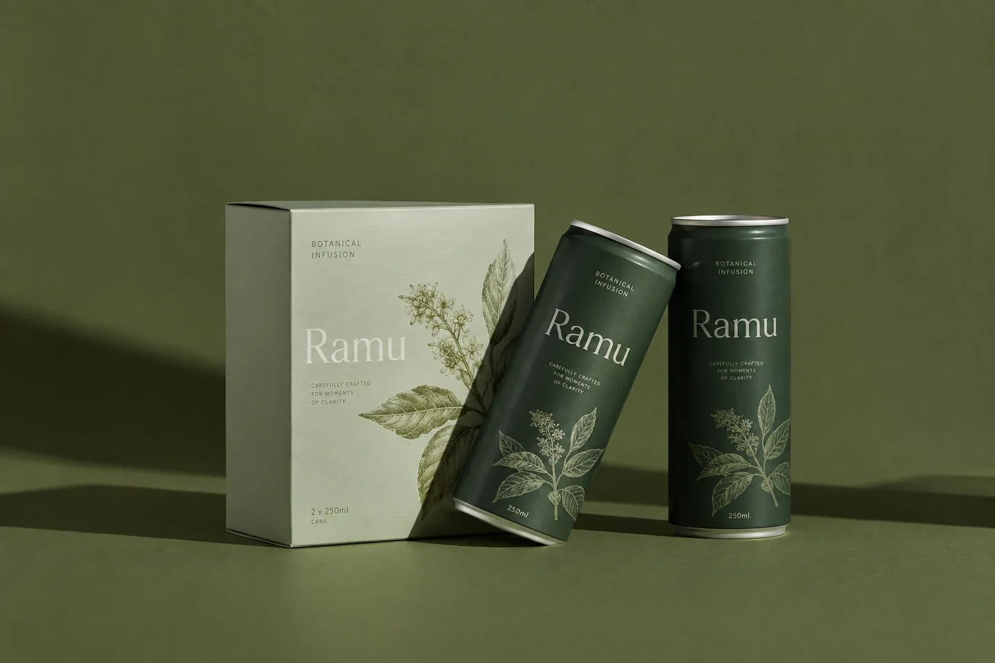
A deep green palette, generous typography, and an uncomplicated label system put ingredients first. The identity stays quiet enough to feel familiar, and distinctive enough to stand on its own.
A flexible packaging direction that connects a family of products through one recognizable visual language.
Concept imagery generated for Indonica. No real client relationship or measured commercial outcome is claimed.
Keep exploring
Ruang.
An independent culture publication with an identity that makes room for new voices.
Next project